


Facility location problems (FLPs) are abundant across many industries for long- and short-term planning of where to place distribution centers, warehouses, libraries, food trucks, or mobile blood drive vans. They all ultimately seek to answer: Where is it best to put my facilities given my operations, requirements, and objectives?
Several optimization solutions such as AMPL, Gurobi, Hexaly, FICO Xpress, and others provide models for solving these types of problems. Nextmv makes prototyping and operationalizing these solutions seamless with DecisionOps tools for model deployment, collaboration, testing, and workflows.
In this post, we’ll show how to start working with a FICO Xpress facility location decision model and Nextmv to track model runs and visualizations in order to build a shareable system of record. We’ll also take the next step and push the model to Nextmv to demonstrate systematic model deployment, management, and testing. Let’s dive in!
Facility location decision model overview
We’re using this facility location Python notebook from FICO Xpress, which is Apache 2.0 licensed and uses the FICO Xpress Community License. (Go ahead and download the file from GitHub. You’ll need it shortly.)
As described in the notebook, school administrators want to convert unused or abandoned sites into parks (or related community facilities like pools) for use by attendees of nearby public schools. They’re looking to decide which sites to select for park (i.e., “facility”) creation based on minimizing one of the following:
- The average distance in kilometers (km) between each school and the closest park
- The maximum distance in km between the school and the closest park
Why two objectives? In the first objective, administrators can make sure park distribution results in relatively consistent distances for most of the schools. But it’s possible to get a solution where all parks are within short distances to schools except for one, which may be much longer. That’s where the second objective comes in: it serves as a check on the first objective, allowing administrators to make sure they aren’t overly unfair to one school.
Given the administration has a defined number of candidate sites to select from, parks to create, and schools to service, where should they stand up new parks to align with their goals? Let’s find out!
Track and log model run data (input, output, results, visuals)
To begin, we’ll be conducting this walkthrough using Google Colab. You’ll need to create a fresh Colab notebook with FICO’s facility location model. You can duplicate their existing one or download the code from GitHub and reupload to Colab. (You can also run this using your favorite IDE on your local machine, if you like.)
Next, do a quick top-to-bottom scroll through the notebook to get familiar with its contents. As you do, you’ll see the notebook sets up a scenario where 4 parks must be built among 11 possible sites to service 9 schools.
To make sure everything works as is, go ahead and press “Run all” in the top navigation to run everything top to bottom. When the run completes, you’ll see some results appear under “Model implementation” in the notebook. This includes a few visuals showing the locations of parks among candidate sites and representation of park distance to nearby schools. You’ll also see the results associated with our two objectives:
- For objective 1 (minimize average distance): Average distance is 2.00 km and maximum distance is 3.54 km
- For objective 2 (minimize maximum distance): Average distance is 2.22 km and maximum distance is 3.33 km
Wunderbar! We have an answer. But what if the administration comes back and says they may have some extra resources to build more parks, or need to service more schools, or there are fewer candidate sites to select from? How do you go about that exploration efficiently?
In most cases (and often with notebooks), producing, tracking, and sharing the work involved becomes an unwieldy side project of scripts, spreadsheets, and screenshots… probably shared over email. But it doesn’t have to be. This is where Nextmv really shines as a platform for streamlining all these pieces (and more).
By the end of this section, you’ll have connected your model notebook code to Nextmv where all your run data (input, output, result value, visuals, etc.) will appear for bookkeeping, management, and collaboration. Let’s get started!
Step 1: Basic model run tracking
You already have the notebook in Google Colab. ✅
Now, you need a free Nextmv account. Simply sign up and verify your account.
When you log into your account for the first time, you’ll be prompted to create and name your first workspace and select the model you want to connect to Nextmv.
(Note: If you’re a returning Nextmv user, you can initiate this flow by going to “Apps & Workflows” and creating a “New custom app” in the upper right corner.)
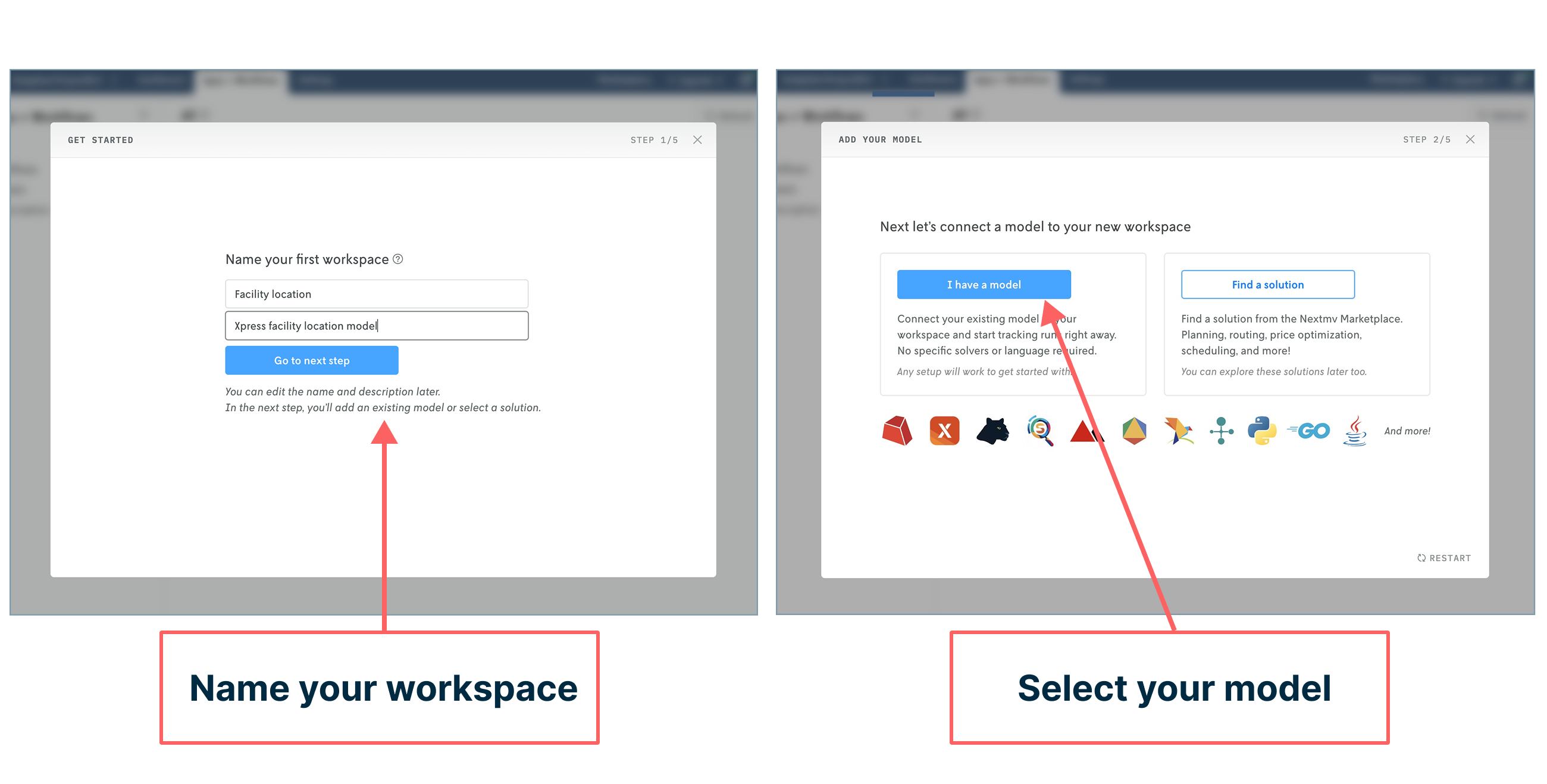
In the next step, you’ll connect your model to the workspace you just created by adding three code snippets to your notebook:
- The first two snippets should be pasted at the very top
- The third snippet should be pasted at the very bottom
As you paste in each one, confirm your code additions in the Nextmv prompts.
(Note: For the future, you can also manage API keys with secrets.)
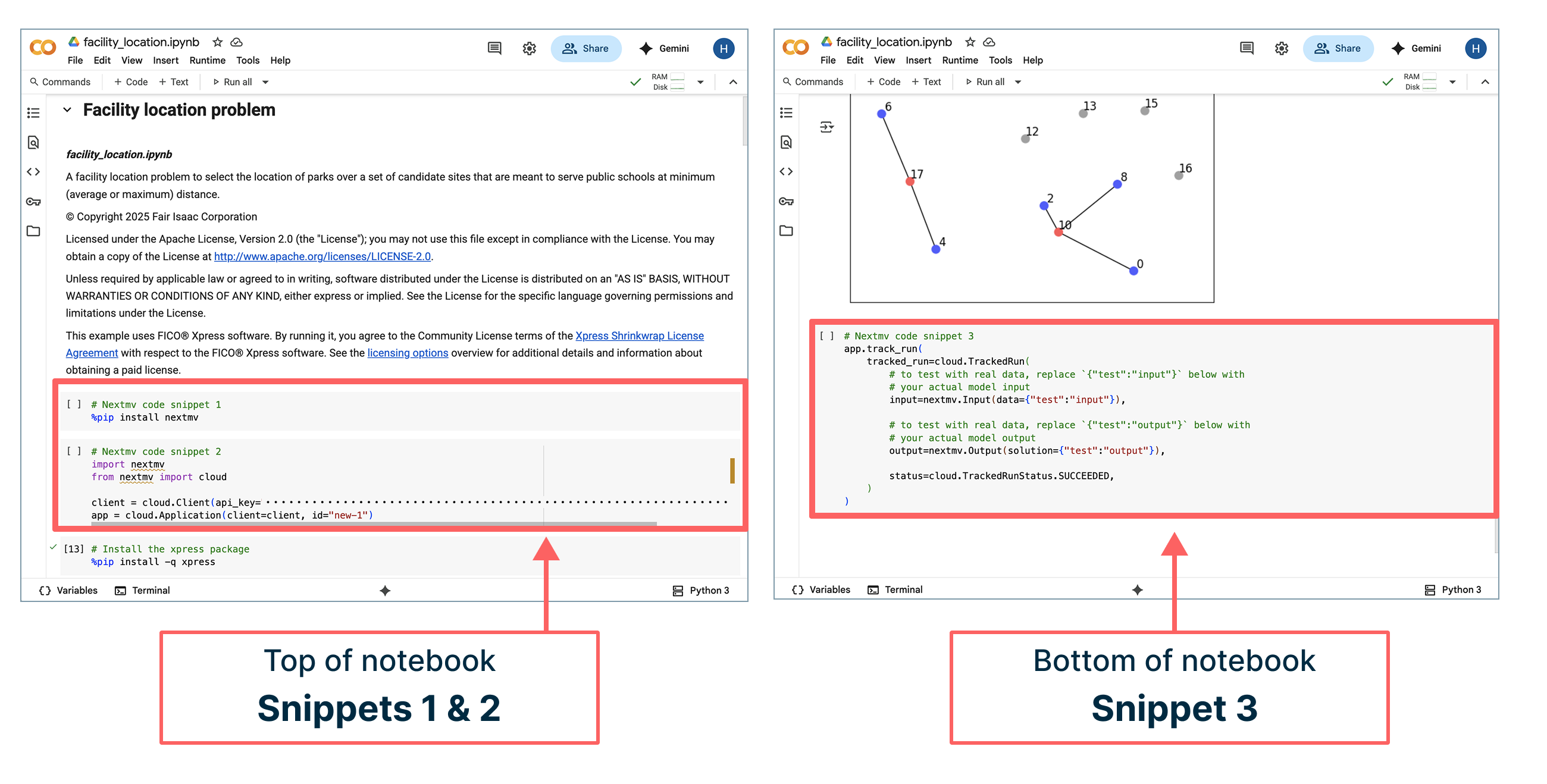
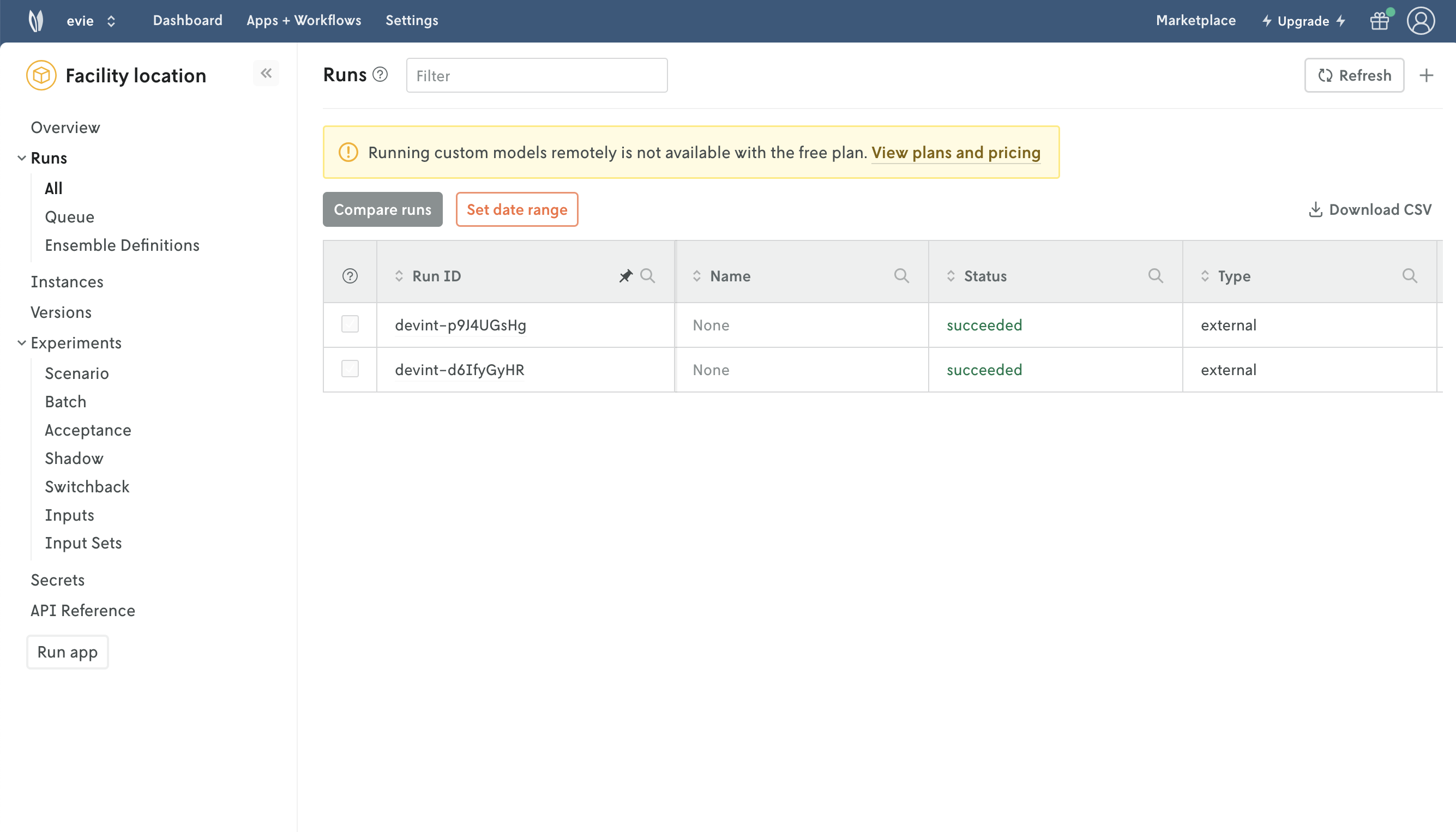
Once your code snippets are added, go ahead and click “Run all” at the top of the notebook in Google Colab. Once the run completes, return to Nextmv to click the “Check for runs” button. Et voila! Your model run made on Google infrastructure has been tracked in Nextmv!
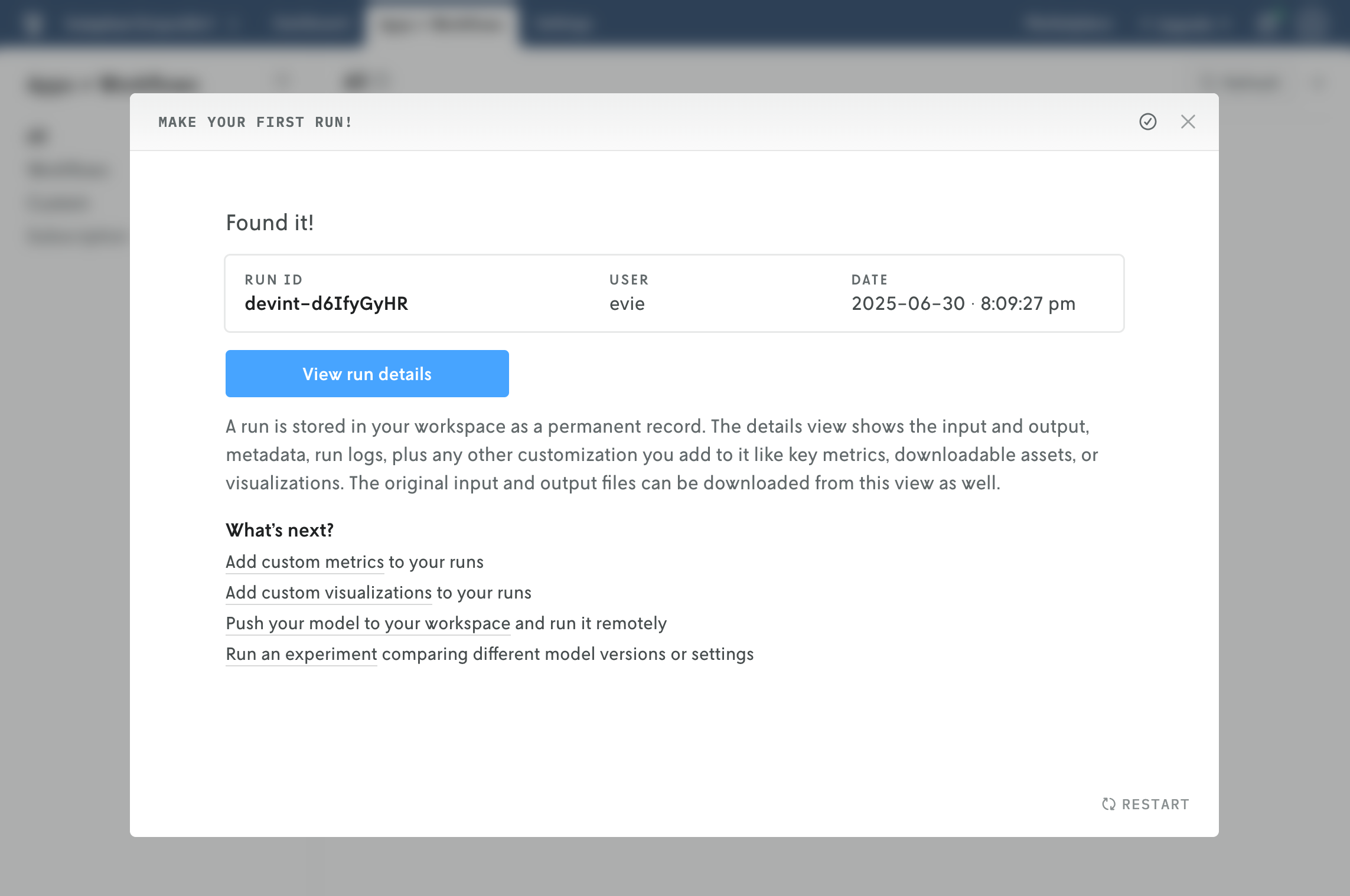
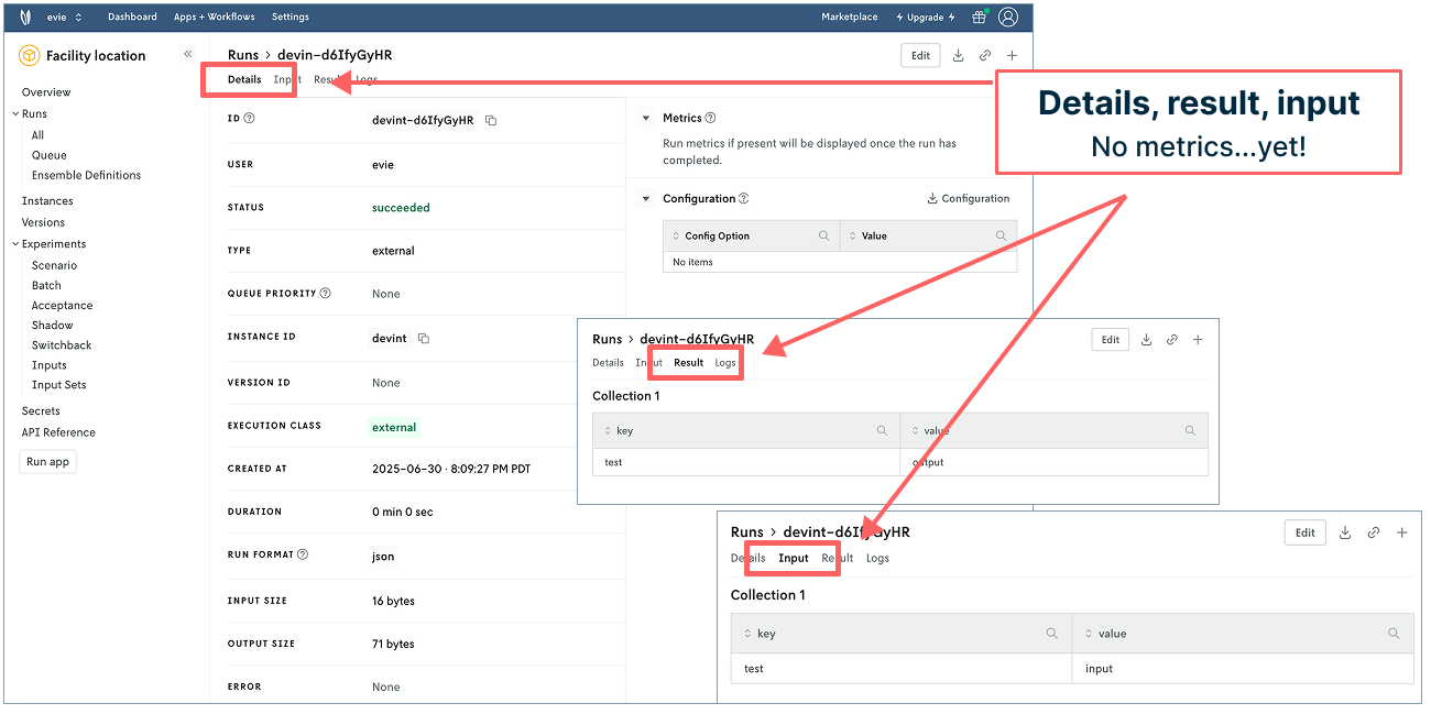
Next, click the “View run details” button in Nextmv to tab through run details, result, and input. You get information about who made the run, when it ran, format, infrastructure used, I/O size, etc. You can also see the sample input and output information.
But we have actual data in the notebook. Why not have that pass to Nextmv for a more realistic experience? Let’s do it. On to the next step!
Step 2: Next-level run tracking with slight modifications
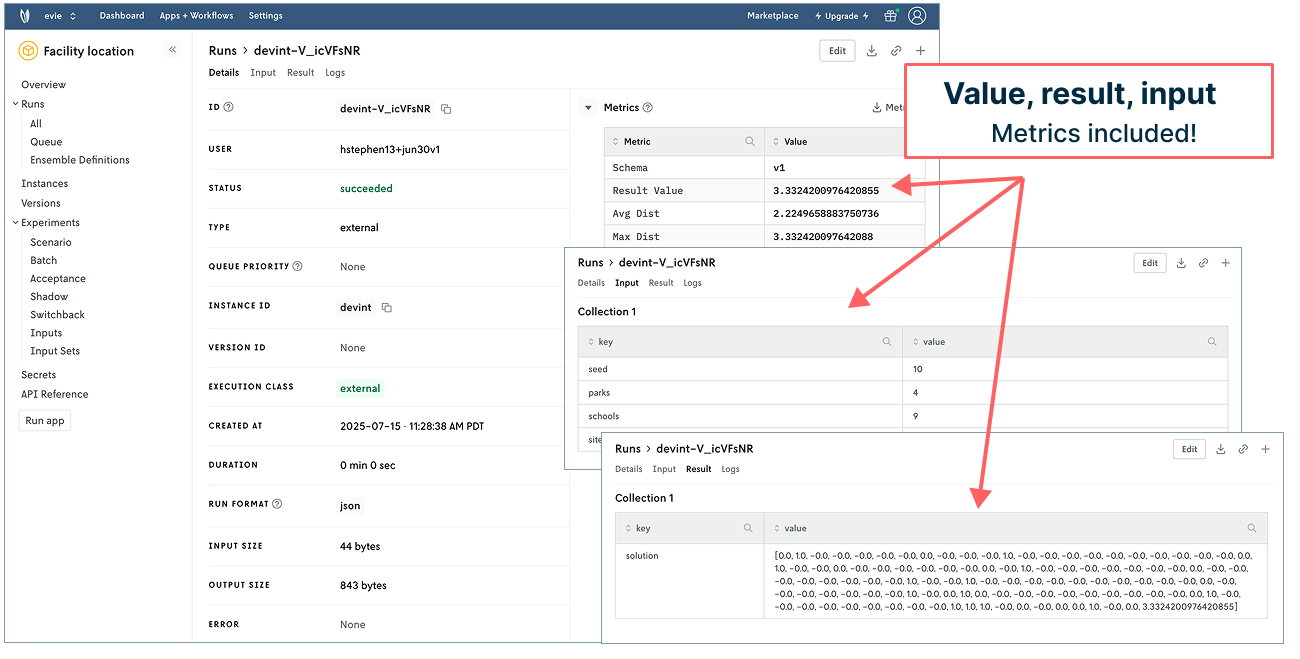
In our next run, we want to see the input data used, output of the result, and objective value in Nextmv. We only need to make a few modifications in our notebook to accomplish this.
First, define the input by copying the following code block into your notebook in the Data preparation section: Just below the code block beginning with import xpress as xp and above the text that begins with “Now we define a function”.
Next, modify the tracked run code (“snippet 3”) at the very bottom of the notebook using the following code snippet. (You can do a wholesale copy-paste swap to keep it easy!) This updated snippet removes some of the original commented instructions, updates the input and solution, and adds a line for statistics to show our objective value.
Now go ahead and click “Run all” again in Google Colab to run the notebook top to bottom. Once the run completes, return to Nextmv. Click on “All” underneath “Runs” in the left navigation. Refresh the window. Ecco qua! You can now see another model run in your account.
Click into the top run to see what you’ve accomplished. The details tab now populates metrics showing your objective value and associated metrics. Hey! There’s the 3.33 km and 2.22 km we noted in the introduction of this post 👍. (Note: If you want to track values for the first objective function in Nextmv, you can move or copy your tracked run code to appear beneath that section in the notebook.) The input tab includes parks, schools, and sites. And the result shows the coordinates for the park locations (such fun for those who are into matrices!).
But what about those nice visualizations in the notebook? Can we have those appear in Nextmv? Yes! 👉 To the charts!
Step 3: Add visualization for managed model run assets
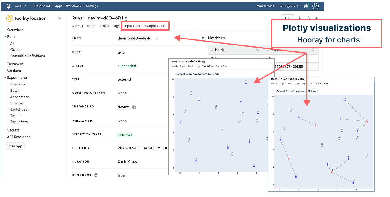
The original notebook supplies matplotlib network visualizations to help communicate the problem solving at hand. Nextmv supports adding custom assets like visualizations from Plotly, Chart.js, and GeoJSON to every single run you make — a handy feature for managing your visualizations. To make the magic happen here, there are three things to do.
First, generate the visualization. The code block below does the following:
- Generates the same network visualization using Plotly (thanks, chatGPT, for the assist)
- Converts Plotly figure to JSON
- Defines the Plotly asset in Nextmv to render in Nextmv UI
Copy this (longer) code block into the bottom of your notebook just above your Nextmv tracking code (“Nextmv code snippet 3”).
Next, copy the following code block below the one you just added to the notebook so we can visually check that the new code is creating what we expect in Nextmv.
Lastly, replace the tracked run code in code snippet 3 with the following. It builds on what you had before, adding a line for passing your chart assets to Nextmv.
It’s time to “Run all” in your notebook again in Google Colab. Once complete, navigate to Nextmv and refresh your window. Behold! You have another run logged in Nextmv. Click into the top run and you’ll see all the information you had before plus two tabs for input and output charts. (Again, these charts will appear every time you run the model alongside all your other run data.)
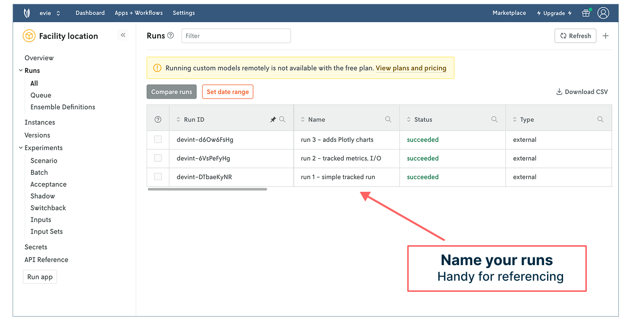
Nice work! You’ve tracked three model runs in Nextmv. To help keep them straight, you can always click into a run, select “Edit” in the upper right corner, and give it a name. These names will appear in your run history, making it easier to grok what you’re looking at in the table.
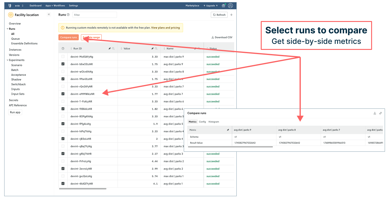
With your third tracked run, you have a way of logging, referencing, and managing your model runs and associated data (input, output, result, charts, and more!). “What was the input for the run that produced this result?” Click into the run to view or download the input to find out. “What did the network chart look like for the run where you changed the input?” Open the run details to view the Plotly charts. “How do the objective functions compare when you increase or decrease the number of parks?” Make another run and then compare the two side by side. No need to build anything, manage anything, script anything, or manage a slew of screenshots.
You could continue to track more runs to explore more scenarios by changing input in the notebook and rerunning each time. You’ll end up with a nice bookkeeping table like the following where you can compare run metrics — and start to get an answer for how varying the number of parks impacts the objective values (which the administration was interested in understanding).
☝️ But there’s a more efficient and robust way to get this level of insight and more by pushing your model to Nextmv and managing it there. Let’s take a look!
Systematic model testing, deployment, and collaboration in Nextmv
Up to this point, all of our model runs have been tracked — meaning run execution took place on Google’s infrastructure (or your local machine) while run data got tracked in Nextmv. When you push model code to Nextmv and run on Nextmv’s infrastructure, your ability to manage and collaborate on all aspects of your model’s data and lifecycle becomes way more robust. In this section of the post, we’ll take a tour of what our facility location model can look like in this context.
For starters, we can implement the park scenario exploration quickly and efficiently. Nextmv’s UI makes it easy to set up the test with exposed options (like objective function), input selection, repetitions, and more. Plus, you can invite people to your Nextmv account and assign them a role to collaborate in different ways.
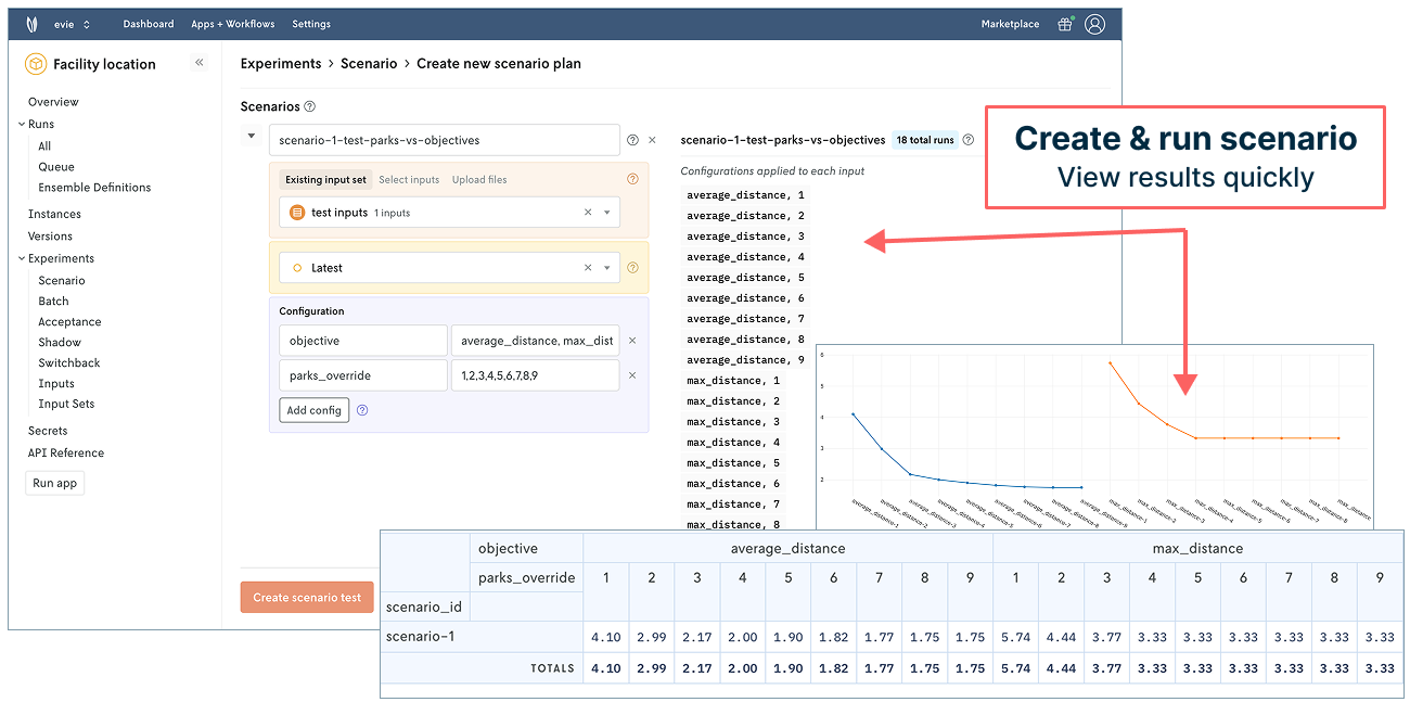
We can also manage and run against different versions of our model. As mentioned in the beginning of our post, there are a few objective functions to consider and have worked with: average distance, total distance, and maximum distance. We can represent those in Nextmv and use them in our model operations.
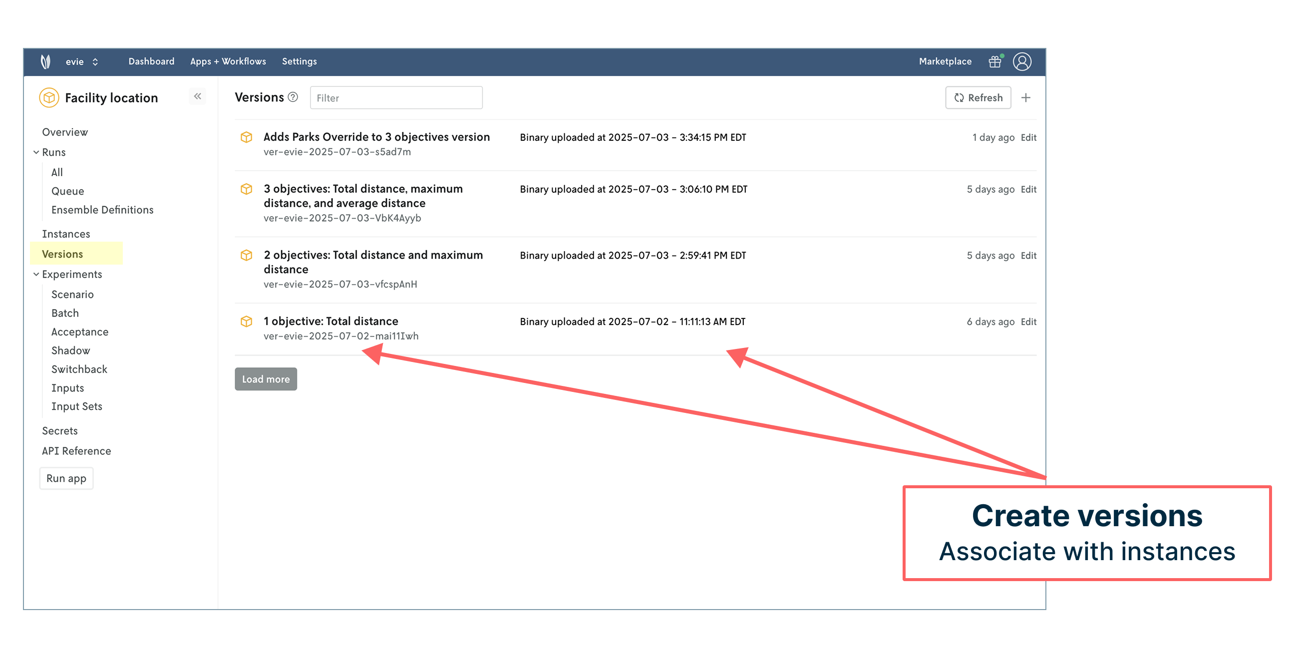
We can assign a version to different model instances. Instances are flexible concepts that can represent anything from development environments to relevant regions, which we’ve done in this case using school districts. Different regions may need to run different versions of the model.
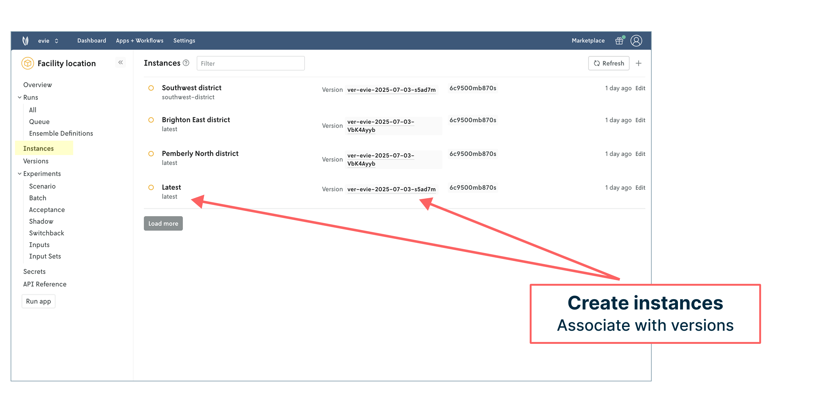
Each of these instances also has a set of dedicated API endpoints to work with. This creates a common API layer that makes integrating and managing your decision science work within engineering tech stacks seamless. Role-based access control also helps define how different types of users (modelers, engineers, product managers, operators, administrators) can engage with the model and its outcomes.
It’s now also possible to create and manage input sets for systematic experimentation for scenario testing as well as acceptance testing, shadow testing, switchback (A/B) testing, and more. The ability to reproduce runs with a single button click is streamlined and useful for troubleshooting issues or ad hoc exploration.
Unlocking all of this capability requires adding some structure to the original model code (what we call Nextmv-ification) to standardize things like input/output, add statistics and metrics, expose options, and print logs. Pushing the code to Nextmv is straightforward — and can include any decision-oriented code such as heuristics, simulation, and even machine learning. You can review what the model code looks like in our GitHub repository.
The process of pushing a model to Nextmv does require a Nextmv Innovator plan, but you can continue to experiment with tracked runs with a free account.
Go and enjoy the P-A-R-K
😅 We’ve covered quite a bit in this post. We started with a facility location notebook example from FICO Xpress, connected it to Nextmv, and tracked model runs (input, output, results, and visuals) to create a decision model system of record. In the end, we explored what it looks like to take the next step and manage our model in Nextmv to streamline deployment, testing, and collaboration.
With so much “park” talk, I’ve attracted the attention of my dog who informs me that her p-a-r-k time has arrived. So, in honor of her patience and your accomplishments with this post, we hope you can take a moment to enjoy a nearby public space.
May your solutions be ever improving 🖖


